After something is written and before anyone ever reads it, there is an uneasy middle ground that is dry and mundane but at one point every kid I knew was interested and completely engrossed in. I can’t even convey to you exactly what it was which stopped it, but at some point, professional interests took over and the flamboyancy of expression that was computer lab procrastination was sapped from my life and never spoken of again. Some easy and stressful pre-covid era that was; when I knew by heart exactly how to make my text somehow shine a metallic gold, and when I, at one point, submitted some one-paragraph essay completely struck-through because it was technically readable and I thought it looked cool. I called this practice ‘making the text look cool’ and I thought at one point I was a master at it, because I believed along with everybody else that if your text looked cool, people would want to read it more and you would get a better grade in return. It was similar to universal truth and at one point the acme of elegant logic and reason that everybody unanimously agreed upon.
That idea is not entirely outdated. There is a point before something is interpreted by its audience, and after it was written, when someone has to sit down and think about what others might think, and they express their own thoughts about a formative work to reflect and cater to what everyone else might think about it. The way they express themselves is through what once was point but now pixels, line height but was once leading, and through a thousand other minute details. There is a point before something is seen by you, when your decisions about a piece of paper or a bit of text are swayed ever so slightly. The mastermind behind this is formatting a work of text. As I described them, they might not exist in any relevant position around us but that does not make them any less real. It just so happens that most of all work would be better typeset as every other. We more or less do not care, and even prefer, whatever is near or in front of us. The best example of our similarities is best shown through our work, and our formatting now. Every human is unique, but our formatting is not. That does not mean formatting’s mark is invisible, when it so clearly still is because, still, you judge what you see and there is a graphic designer out there who is trying, diligently, to maximize perceived visual harmony over a work of text using visual implements, images, and the small differences in letter spacing; such that maybe, visual strain might be reduced and some amount of visual harmony is gained. This idea may sound mythical if somebody is consciously thinking this over. But, really, in professional settings, people would do anything to have an edge in some kind of readability or preference to viewers. Outside of those professional settings all of this talk is the idea of maximizing what ‘looks good’, which is something I know many people would do when positioned in the design chair of a large volume of text and which has only ceased to have been stressed when our teachers instructed us on exactly how to confront this dilemma with 12 point font and Times New Roman. But also, more importantly, when we stopped caring how our PowerPoints would win over our peers’ eyes when we presented them because professionality, we believed, was doing something efficiently. In this near gentrification of textual expression something was lost and very notably so. At one point, every single bit of text in Microsoft software was a slider where (at some points more appropriately than others) a little bit of expression could be found. This though does not mean that those bits of expression have gone away, it is probably better for all of our eyes that we stopped messing with font color or weight. The interesting part is that it means we have stopped caring about the way information is presented to us outside of its literal meaning and not on very many contextual clues about the text itself. This is a mistake.
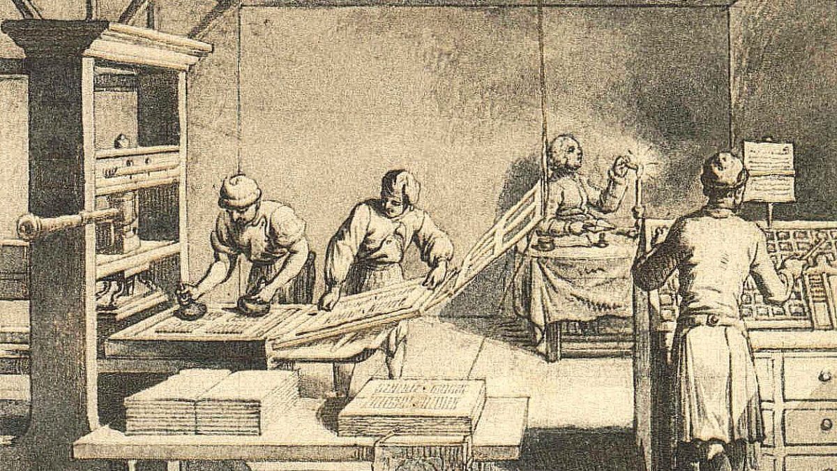
The earliest known idea of compliance or care to formatting standards in printed text goes back to Johannes Gutenberg and the Gutenberg press. His original typeface was inspired by the scribes and monks of medieval Europe, and it was a Gothic Style of typeface referred to as Blackletter. This type was criticized for a poor legibility and was quickly and then rapidly succeeded by a family of fonts called seraph fonts which included flourishes at the ends of some letters called seraphs. These fonts are viewed now in newspapers and things that are fancy or ‘modern’. Modern in the sense that it is timeless. This was only then surpassed by sans-seraph fonts which got rid of seraphs and are the fonts which anyone would recognize as truly ‘modern.’ Only afterward was the computer invented (which briefly only allowed pixelated letters) but then shortly everyone had the ability to make and share whatever font they wanted. This was the advent of modern computer typography and formatting. Like most things on the internet at the time, typography was a ‘wild west’ where people heavily stylized their own webpages to look unique. A very predictable biproduct of this was that things were very hard to read or understand. It also just didn’t look very good. This is where the whole joke of Comic Sans font comes from; its unprofessional look and abundance in (what other than) professional settings showed the amateur quality of design at the time, and the font was a hallmark of internet web pages and blogs in the early scene of typographic design. After the early internet web pages, a sort of style developed. In this development, in 2008 the WCAG was designed as a guideline for all online web page design concerning accessibility and now lots of it is built into contracts and the government’s web pages. Any page now has some compliances to WCAG standards.
The real meat of formatting and design is the modern and ‘classic’ methods for which formatting text falls into (which is really in one of two categories). The first method being the latter, the ‘classic’ method where formatting and fonts are entirely born out of complete necessity. For example, modern seraph fonts were only built out of the need for text to be more readable, and the text after that was made to fit more modern contexts. Italics were only invented to make printing cheaper, and then afterwards their use was only extended to convey the need to emphasize certain words. This is how most conventions of text were made, out of pure necessity and nothing really more. This is a classic idea because it is timeless and transcends the medium of paper text as something to be more versatile and easier to spread. A sort of philosophy that formatting is nothing in and of itself but a means to digest text (which holds the real meaning) is not uncommon and even standard in many settings where attention of the text is guaranteed to some impartial (and often critical) viewer. The secondary method of formatting is the more modern web-graphic design built around the modern information landscape. This camp of design is combined with more aesthetic ideas of formatting collided with the field of calligraphy, emphasizing aesthetic value in text. In some ways It is also more mathematical creating new units to measure text which are pixels as opposed to points. Where 16 pixels is equal to 12 points and 12 points is equal to 1/6 of an inch. These measurements, while also born out of necessity, are the real modern innovation in conjunction to the idea and use of an em spacing. An em spacing is a unit of measurement most commonly referred to as 12 points and is used as the base size of a font. This spacing is used in conjunction with the online web design now as a basis of scale rooted in reality. The mobile, centrally referential use of an em space makes it so, when an em is redefined online, text formatting updates quickly and reliably without losing respective scale. This sort of malleability to retain certain rigid design choices shows the value of those design choices and their display over many mediums. It’s the sense of scale and retaining ratios which is so important because after that, designers online would manipulate specific spacing in a font, which couldn’t be done on a typewriter or even specific breaks in text to include multimedia which would be more resistant to display and aspect ratio changes. What is clearly shown out of this modern usage is the importance, of the weight of text, its contrast, color, and font’s mixture with images, multimedia, and interactable text elements. All of these tools are born out of expression, a modern expression which in some way is also surprisingly mostly built from the necessity of more classic design conventions.
Aesthetic purposes of textual formatting and typography make sense; however, the reason behind this new approach to formatting text based off of style comes from the new age of excessive attention. The internet is an attention space based off of how much traffic pages, or of how many views a certain design can get. These newly re-enforced attention-based incentives drives a shift in formatting from a classic need to meet some need to be an addendum from which additional attention can be gained or at least a considerable increase in ease of reading. This is why much of modern page-based formatting focuses on what is ‘easy to read’ or what exactly would cause the minimal amount of eye strain to gloss over. What that means exactly is not very well defined, but what it roughly does mean is that contrast should be significant enough not to confuse the reader. The font of major headings should conform to an aesthetic which matches the context of the work. The work should have a consistent typographic system throughout (similar fonts, conventions of style, etc.). Big blocks of text and images should divide neatly to fill columns which are consistent throughout the page (unless stylistic concerns intervene). The line height should remain roughly inversely proportional to size. Large headings should have closer character spacing to reduce eye strain. Kerning should also not be distractingly close together… etc. The point being that there is great thought and concern on exactly how the typography and formatting should reflect an ease on the eyes and how it’s meant to draw attention to certain small stylistic concerns regarding the font itself and the font itself should reflect the aesthetic of the work whether that be business related or whatever it may concern. The fact being the depth of consideration on exactly how you digest pages of information and how images and text boxes tend to be situated on the right sides of pages. The gait of the eyes is something typographic designers have been concerned with forever and it shows the usage of typography in a fashion which is aimed at capturing something and presenting it to the reader that previous text systems of formatting couldn’t: ease and style. Though, the opposite of this convention is also true. Which while still attention grabbing does not necessarily aim for ease.
Non-conventional formatting is perhaps the most interesting form of formatting. I, myself have not explicitly yet set out to capture eyes in the particular brain-hacking manner that conventional typography suggests. Really, I only ever click the ‘expand’ tab under the paragraph or font tabs in word because I want to do one of two things: fit a lot of words onto a page without making it obvious that I have done so or make my text golden and have a shadow. Neither of which I have done very recently, but I have been brought back to formatting because of the explicitly non-conventional and how it impacts the way you see the conventional. The fact about formatting in this way is that whether you internally realize it or not, any creative work or writing is impacted by the way you choose to present it. For some works of art that is the entire point of the work, the presentation, and the performance of it. Usually, this side of the work is responded to with only disapproval directed toward the state of modern contemporary art, but the fact is that the presentation of any work is the conversation between the artist and the viewer in a way which is closer than the art itself. Most of printed history has viewed this as sort of a middleman distancing the true art from the artist but the recent revelation that it’s not just an obstacle but also a means to express more is a very interesting progression because it recontextualizes all presentations of work before it. One great example of this use of formatting as artistic presentation is the article on SBNATION: What football will look like in the future by Jon Bois. Not only is it a really profound look into very mundane things and how meaning lies not only in how bombastically things warp in an obvious manner but also how the extremely ordinary work their way into attention through their non-apparent novelty. Other than that, however, it is a really good example of really extreme formatting in a way that adds entirely to its presentation, and it shows how digitally enhanced formatting can show distance, space, and amplify feelings of loneliness or banality. The story puts you in front of something that nearly needs you to put work in to read the thing and, it’s a great example of how non-conventional formatting can get. Rarely anyone would describe 17776 as a formatted work of text, but it is and it’s a very interesting one at that because of its insanity and its inability to ever really be printed as you would expect text to be able to be. What has worked its way into print is another book known as House of Leaves by Mark Danielewski which is a nesting doll sort of horror novel centered around insanity and a house which continues to grow and shift on the inside. I personally didn’t find it super inspiring, very honestly, but what is very interesting is its formatting. It allows its big moments, and its creepy ones to feel a lot bigger. While, at points it’s quite gimmicky, at others it uses a very interesting use of font to illustrate the layers in which it was written and contrast its more academically worded moments with its more insane. At times parts of the novel are printed vertically across the pages, or mirrored, or even sometimes entirely stricken in red. It’s a very interesting use of formatting because everyone knows how to do that in word, but when has anybody turned the word document landscape in settings? It’s interesting to see it utilized and presented even if sometimes uninspiring or cheap.
Formatting has occupied this weird space in my mind at least for quite a bit. It’s not a very normal or even very natural thing to think about; because, in my recent few looks back at Microsoft Word’s capabilities of messing with spacing and a font’s typography what this heavy, advanced formatting really gives me is this feeling of unease. It’s a paralysis over the feeling of fear that I might mess something up by editing my own word documents. What formatting is and has come to be is this alien and dangerous thing that I choose to ignore even when it’s directly in front of my face and between my fingers because I believe the original meaning of my work is all there is to it. There is no straight forward way to find every convention of English text in existence and know the ins and outs of every single piece of editing text because there just is too many. Mathematical texts follow separate conventions from bibliographies which are separate from blog pages and that ad infinitum. But, only in that nuance of presentation and the uncomfortable middle between authorship and the observation is there something interesting and also capable of completely blinding oneself–– hidden away.